After a little Holiday hiatus, during which I did NOT take any holidays, I am happy to be back to my blog.
I hope everyone had a great time during the Holidays and that 2013 will simply be a dashing one.
New Year, new beginnings, new resolutions, new projects, new home?
My first article of 2013 will talk about a few trends that I see being in the heart of new designs in 2013. For those thinking of renovating, acquiring a new home or perhaps just adding a new wall colour or decor, I bring 4 trends to watch out in 2013.
Quarts/Caesarstone countertops have been the top choice for new kitchens. It’s scratch, heat and stain resistant, making it the ideal choice for all kitchens.
Quartz/Caeserstone, however, is a man-made material using natural quartz, resin (for colour) and aggregates. It unfortunately lacks the luster and appeal of natural marble with all its veining and contrasts.
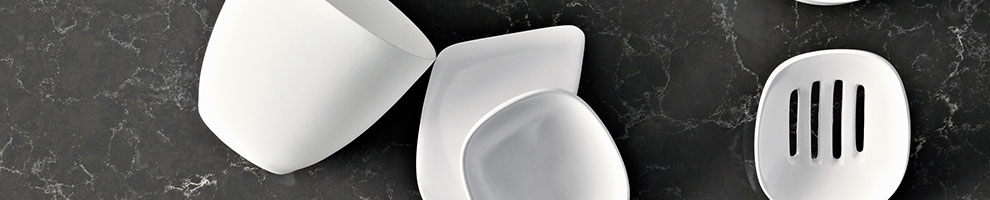
This new “supernatural” collection is the closest thing to the marble look in the caesarstone/quartz family. Making now possible to have a stunning marble looking countertop with the super properties of ceasarstone.
My favourite ones are:
Emperadoro
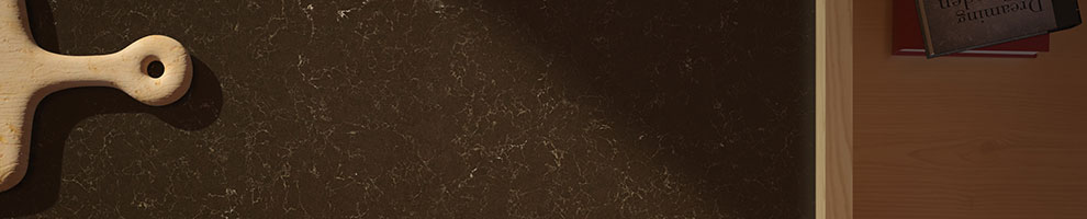
and Pietra Grey
So a few weeks ago, Pantone announced “Emerald” is the colour of the year for 2013.
I was not shocked, but pleasantly surprised, as I was seeing lots of blue and deep greens appearing on furniture, pillows and walls.
Here are 3 colours that I see coming out to play in 2013.


Art should be unique, personal and tell a story. It creates a focal point or complements a room.
This year, more than before, we are seeing a detachment from conventional framed prints, photographs and canvases and the return of sculptures or objects attached on a wall as Art.
The choices are endless, from window frames to metal and wood sculptures. Wall art is now all about objects, so creativity is the name of the game.

Whether used on foyers, bathrooms or backsplash, penny round tiles are having a huge comeback. Reminiscent of our own Dupont Subway station, these little round tiles allow you to have a curved and seemless transition from floor to wall, without a baseboard. Also, it’s very easy to create a “rug” effect on a floor, by only using the penny round tiles on a certain area of the floor.


And these are just a few quick trends I am forecasting for 2013.
I hope everyone had a great time during the Holidays and that 2013 will simply be a dashing one.
New Year, new beginnings, new resolutions, new projects, new home?
My first article of 2013 will talk about a few trends that I see being in the heart of new designs in 2013. For those thinking of renovating, acquiring a new home or perhaps just adding a new wall colour or decor, I bring 4 trends to watch out in 2013.
- Natural Looking CaesarStone - “supernatural” collection
Quartz/Caeserstone, however, is a man-made material using natural quartz, resin (for colour) and aggregates. It unfortunately lacks the luster and appeal of natural marble with all its veining and contrasts.
This new “supernatural” collection is the closest thing to the marble look in the caesarstone/quartz family. Making now possible to have a stunning marble looking countertop with the super properties of ceasarstone.
My favourite ones are:
Emperadoro
and Pietra Grey
- “In” colours for 2013
So a few weeks ago, Pantone announced “Emerald” is the colour of the year for 2013.
I was not shocked, but pleasantly surprised, as I was seeing lots of blue and deep greens appearing on furniture, pillows and walls.
Here are 3 colours that I see coming out to play in 2013.
- Jadite - SW 6459 Sherwin Williams

- California Blue - 2060-20

- Newburg Green - HC-158 Benjamin Moore

- Wall objects/sculpture
Art should be unique, personal and tell a story. It creates a focal point or complements a room.
This year, more than before, we are seeing a detachment from conventional framed prints, photographs and canvases and the return of sculptures or objects attached on a wall as Art.
The choices are endless, from window frames to metal and wood sculptures. Wall art is now all about objects, so creativity is the name of the game.
 |
| West Elm Wall Sculptures |
 |
| Sea Urchins wall Art |

- Penny round tiles
Whether used on foyers, bathrooms or backsplash, penny round tiles are having a huge comeback. Reminiscent of our own Dupont Subway station, these little round tiles allow you to have a curved and seemless transition from floor to wall, without a baseboard. Also, it’s very easy to create a “rug” effect on a floor, by only using the penny round tiles on a certain area of the floor.


And these are just a few quick trends I am forecasting for 2013.
Time will tell ;-)
Theo Flamenbaum
- Style + Function + Love + You -


