Showing posts with label decor. Show all posts

Sunday, January 6, 2013

2013 trends

Hello dear readers,

After a little Holiday hiatus, during which I did NOT take any holidays, I am happy to be back to my blog.
I hope everyone had a great time during the Holidays and that 2013 will simply be a dashing one.

New Year, new beginnings, new resolutions, new projects, new home?

My first article of 2013 will talk about a few trends that I see being in the heart of new designs in 2013. For those thinking of renovating, acquiring a new home or perhaps just adding a new wall colour or decor, I bring 4 trends to watch out in 2013.

  • Natural Looking CaesarStone - “supernatural” collection

Quarts/Caesarstone countertops have been the top choice for new kitchens. It’s scratch, heat and stain resistant, making it the ideal choice for all kitchens.
Quartz/Caeserstone, however, is a man-made material using natural quartz, resin (for colour) and aggregates. It unfortunately lacks the luster and appeal of natural marble with all its veining and contrasts.

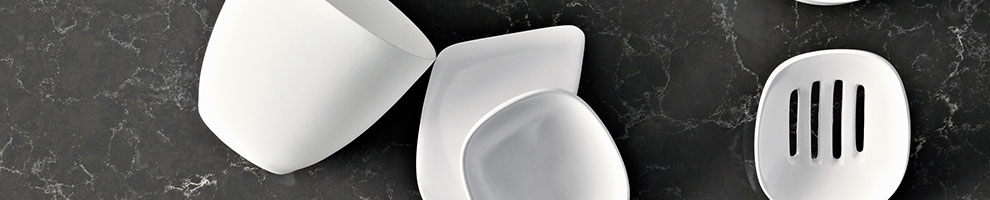
This new “supernatural” collection is the closest thing to the marble look in the caesarstone/quartz family. Making now possible to have a stunning marble looking countertop with the super properties of ceasarstone.

My favourite ones are:
Emperadoro
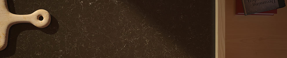

and Pietra Grey

  • “In” colours for 2013

So a few weeks ago, Pantone announced “Emerald” is the colour of the year for 2013.
I was not shocked, but pleasantly surprised, as I was seeing lots of blue and deep greens appearing on furniture, pillows and walls.
Here are 3 colours that I see coming out to play in 2013.

  1. Jadite - SW 6459 Sherwin Williams


  1. California Blue - 2060-20


  1. Newburg Green - HC-158 Benjamin Moore


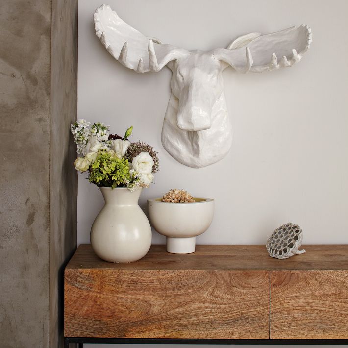
  • Wall objects/sculpture

Art should be unique, personal and tell a story. It creates a focal point or complements a room.
This year, more than before, we are seeing a detachment from conventional framed prints, photographs and canvases and the return of sculptures or objects attached on a wall as Art.

The choices are endless, from window frames to metal and wood sculptures. Wall art is now all about objects, so creativity is the name of the game.

West Elm Wall Sculptures

Sea Urchins wall Art


  • Penny round tiles

Whether used on foyers, bathrooms or backsplash, penny round tiles are having a huge comeback. Reminiscent  of our own Dupont Subway station, these little round tiles allow you to have a curved and seemless transition from floor to wall, without a baseboard. Also, it’s very easy to create a “rug” effect on a floor, by only using the penny round tiles on a certain area of the floor.


And these are just a few quick trends I am forecasting for 2013.
Time will tell ;-)

Theo Flamenbaum
- Style + Function + Love + You -

Thursday, December 6, 2012

Pantone's 2013 colour of the year - Emerald

Hello dear readers,

Earlier this year, in early Spring, I talked about Pantone, who they are and the colour of the year for 2012, Tangerine Tango, in this article: Colour of the year.

Well well... it`s with lots of excitement that I announce that Pantone has released the 2013 Colour of the year: PANTONE 17-5641 Emerald!


From their press release, Pantone explains: "Emerald, a vivid, verdant green, enhances our sense of well-being further by inspiring insight, as well as promoting balance and harmony".
We see a return to a jewel tone colour, suggesting luxury and sophistication. In many cultures, this is the colour of growth, renewal and prosperity!! Oh do I see people using this colour now!

In terms of Interiors, Pantone also says:

"Enhance your sense of well-being at home by rejuvenating the interior with Emerald paint, accents and accessories. This jewel-like hue will create a luxurious feel in an entryway, powder room, dining room or study, and bring life to a living room as an accent wall. Add a splash of color to the kitchen and dining room areas with Emerald dinnerware, stemware and appliances.
Enliven your home with Pantone bedding, pillows, bath towels and accessories in Emerald available exclusively at jcpenney stores and on jcp.com beginning Feb. 1, 2013.


“As we re-energize our home department next spring, we are excited to partner with the leading authority on color to introduce the first-ever line of Pantone bedding and bath products,” said Paul Rutenis, jcpenney general merchandise manager for home. “The cheerful array of on-trend pieces will make it easy for customers to infuse the perfect color into any home décor.”

I particularly love the marriage between freshness and sophistication that this colour provides indoors.
Because this colour also has a very defined presence you can use it as little as a couple of pillows or a full wall covering to make statement.


And even though it's still December, Pantone also takes advantage of the press release to talk about trend colous for Spring 2013:


The choices are endless.... and it makes me want to run to a fabric store and just go nuts!


Theo Flamenbaum
- Style + Function + Love + You - 


Tuesday, November 27, 2012

Less is more!

Hello dear readers,

In this year end, full of glitter, glitz and lights, we are always thinking about how to outdo last year's holiday decor. Should I go with a real tree? What colour scheme should I do this year? Did I miss the Bay's Holiday Decor sale?
Well, you can stop right now! Because like the old cliché says: Less is more!

Why not go minimalist? or simple?
Let's not forget to take a breather this Holiday season and return to simplicity.

With that motto, I am showcasing a few directions one can take when deciding to go for less while searching for your Christmas tree:


Bendable copper + LED = Win!

You can mold the lights to whatever object you want! And it comes in warm yellow or cool white.
So what to do:
Get yourself a tall cylinder vase, and some branches. Wrap the wire around the branches and you got yourself a lit-up simple Christmas tree!


  • Be creative! Hanging Christmas balls on strings.

This idea is genius! Just get your Christmas balls from last year and some fishing line. You can hang them off a light fixture of attach them to the ceiling. It's airy, it's flowy, it's simple!


I love everything that is recycled, repurposed, reused! These little cuties come in 2 different sizes and complement a cool urban, condo-lofty Holiday decor.

  • Ornamental branch or log

This would look amazing over a sideboard, console table or hutch. You can pick a few of your favourite Christmas tree ornaments and hang 3 to 5 just for a little shine. This is simple and uber inexpensive.

  • Oak blocks tree and tea lights - For the handy ones or good friends with carpenters :-)


This is absolutely beautiful and completely translates the essence of simplicity. I was only able to find this for sale from a website in Australia, even though it's manufactured in Germany. But if you have some tools and a handy guy, this is totally doable with blocks of oak or any other wood, stained and nailed together. At the tip of each block, you put a tea light and ta da! Cool and unique!


So that's it! You don't need to go overboard to make a statement!
Like the plaque in my home office says: "Simplicity is the ultimate sophistication".

Theo Flamenbaum
- Style + Function + Love + You - 


Saturday, November 24, 2012

Crème de la crème

Hello dear blog readers,

Today, I will talk about a colour that has stood the test of times. Cream!
It's safe, it's subtle and it's bright!
Cream is an option for everything in interiors: walls, ceiling, upholstery, drapery and window treatment and even rugs and carpeting.

I decided to pick 5 attractive, fresh and contemporary "creams" that will brighten up your space.

I would also like to mention that: the more "yellow" undertones, the warmer the colour is, and the closer to grey-white, the cooler it is.

Finally, for renters, the "creamy" road may be a great compromise that landlords will be happy with.
Enjoy :-)


1- Pittsburgh Paints - Creamy White 5122


This one is the closest to a neutral cream I found. It's almost "nude". With a slight "peachy pink" undertone, this colour will work tremendously well with any other colours in order to create a superb colour scheme.


2- Benjamin Moore - Crème Fraiche 2023-70


Definitely on a warmer side, this colour is great for ceilings and hallways because it will brighten up the space. It`s cozy yet elegant.


3- Sherwin Williams - Creamy SW 7012


Now moving over to the cool side, this toned down cream, works wonderfully with blues, purples, greys and greens .
It's also the perfect colour for walls. This colour recedes making accents pop out more.

Walls painted in SW 7012

4- Sherwin Williams - Morning Sun SW 6672


Warmer than the previous ones, great for foyers, walk-in closets and kitchens and studios.

Home Office painted in SW 6672

5- Benjamin Moore - Affinity Colours collection - Frappe AF-85


Very sophisticated, this is a very "taupey" cream. Lots of greys and undertones of brown giving an earthy twist to the family of creams. Extremely safe and neutral, it will be the perfect background colour for any room!

Living Room in BJ Frappe (AF - 85)

The bottom line is: Cream is safe! and it is easy to use with a huge array of complementary colours. You can also go warm with yellows, oranges, reds and browns. Or you may opt to cool it with greys, blues and greens.

Whichever way you go, you have to be careful not to pick a cream that is too yellow... or a cream that is basically white. Trust me, there is a right "cream"! Actually, I just gave you five ;-)

Theo Flamenbaum
- Style + Function + Love + You -


Sunday, November 18, 2012

Christmas party table essentials

Happy Monday everyone.
So, are the Christmas parties getting lined up and dotting your calendar?
And you decided that you will host one yourself?
Throwing a party can request quite a Herculean effort. From planning and buying things, to prepping food and beverages. You also have to make sure your friends RSVP, and the list goes on.
So I won’t help you with the menu, or the food and drinks, but I will give a few recommendations on some stunning “must-haves” for your own Xmas party!

Cheese boads:


  • Slate stone cheese board - Kitchen Stuff Plus


  • A definite steal! For only $7.99 this cheese board is stylish yet practical, easy to clean and very very wallet friendly! It comes with felt footings and it’s just under 11” x 7”.


    Rich looking, the beautiful grains of the olive wood are intensified by an organic oil finish. They come in 3 different sizes and serve as beautiful decor elements when not being used. Also, they come with a leather string for hanging.


    The cool and smooth surface of marble, if refrigerated before the party, can keep the cheese and fresh fruits nice and fresh for hours on.
    It’s simple yet sophisticated! This piece comes in a matte finish that will not show as many scratches as a glossy finish would.
    Not inexpensive, but a piece you would keep for a lifetime because of its classic look and versatility!
    Remember, in Design, spending money on timeless pieces is always a good investment.

    Ice Buckets:

    • Royal Doulton "Pop in the drinks" collection

    Contemporary spin from the British quintessential house of china. It’s “grown-up and chic, but still cool. Available at the Bay, averaging $136 CAD.


    Cheap and cheerful, only $12 on Fab.com, this piece is in acrylic and dishwasher safe!. And good for outdoors for your summer parties too!


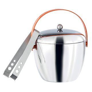
    My fave! It’s urban, it’s sleek, it’s sensual and it is shiny!
    Perfect size and double walled so that the outside wall doesn’t drip! Good news: RIGHT now on special at the Queen/Bathurst store for $32.


    Centerpiece:

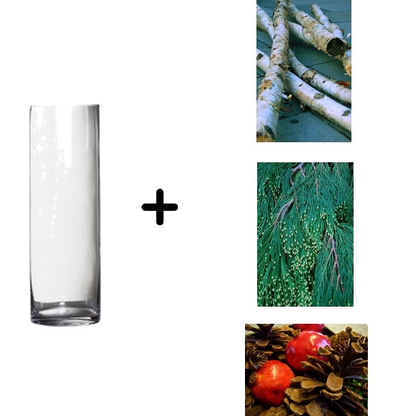
    Simple and inexpensive, these 3 festive centerpieces will create a focus point on your table and a more organic holiday decor for your place.
    - 1 Extra tall cylinder vase
    Your choice of 1 of the following:
    - Birch logs
    - Fresh pine tree branches and leaves with needles (I prefer Western Cedar because of its textured tips in the needles). Also remember to add water to the vase
    - Extra large pine cones with pomegranates


    I hope this article has provided you with some fresh and useful Holiday party hosting ideas.
    Have a fantastic week!

    Theo Flamenbaum

    Wednesday, November 14, 2012

    Safari tour

    Happy Wednesday everyone,

    Hope this week is treating everybody well.
    One design trend that was a hit in the 80's has had quite a comeback: Animal prints! Either you love it or hate it.
    However, a successful design is a design that will embrace a trend and layer in a timeless and cohesive execution, therefore creating a harmonious result.

    With that in mind, I would like to feature 4 décor elements that will refer to the animal print & safari style. But it will not go overboard or give you the feeling of having an animal carcass in front of you!


    • Solid colour cow hide - preferably white
    It adds richness and beauty to a room. Uniting  the edginess of a cow hide with the softness of the solid white colour. Beiges and solid blacks work really well too.


    • Snake skin wallpaper
    Perfect if you are a lover of animal prints and want it in a big scale! Remember to be subtle. Here are 2 amazing options that will allow you to cover walls without compromising the chic element.

    Dwell Studio - Gate pattern
    This pattern is dynamic and will create an impressive feature wall


    Maya Romanoff - Slink pattern
    100% vinyl. It has texture, it has a sheen and it will make any powder room a stunner!

    • Faux fur pillows
    Restoration Hardware has a beautiful collection with 6 different colours and 2 different sizes. You can always re-use the inserts and use the faux fur pillows for Fall-Winter and a nice light silk or linen for Spring-Summer.
    My favourite colours are MINK and SABLE


    • Papier Maché animal head
    Our friends at West Elm released this fun collection in a plethora of animals ranging from rhinos to giraffes. It's a great compromise for the animal lovers that love the look but couldn't have a real animal hanging on their wall. They also have a newsprint paper version for a more urban spin on this safari vignette.


    So, you now is your turn to show your animal instinct!

    Theo Flamenbaum
    - Style + Function + Love + You 


    Sunday, July 15, 2012

    Eye catching Ikat

    Hello dear readers,

    Today I am doing an entry on a decorating trend that has swept the entire world. All showrooms have them: IKAT pattern pillows.


    Ikat dying originated in Indonesia and means to "bind" or to "tie". It pretty much refers to a very ancient technique in dying the threads before they're woven to create a pattern. Its beginnings date from the pre-Columbian times and there are different variations all over the world.

    Today's technology allowed us to recreate the "look" of the woven pattern using a simple dye technique. Now Ikat patterns are found on silks, cottons, linens, you name it.


    So... how to use them?
    The choices are endless and they're everywhere.
    They allow you to work with ANY colour scheme and will instantly add visual interest with its geometric shapes and patterns.

    • Use them in groupings 
    They are more effective and dramatic result if they're used in groups. The patterns can be the same or different, and the colours should complement each other.


    • As an identical set
    for adding pattern to a monochromatic room, or for a more formal look


    • Mixing with solids/geometrics
    For a juxtaposition/complementary function


    Theo's picks:

    Dwell Studio Ikat Citrine -

    Anthropologie's Watercolor Ikat - 


    Theo Flamenbaum
    - Style + Function + Love + You -